Learn.xyz · Founding Designer · 2022–2025
Learning that doesn'tfeel like learning.
Three years.One vision.
From a blank Figma file to a funded product used by teams worldwide. Here's how the work unfolded.
Nobody finishescorporate training.
80% of workplace courses go incomplete. The content reads like compliance checklists. The interfaces feel like they were designed in 2011. And the people forced to use them? They alt-tab the second their manager looks away. Learn.xyz started with a provocation: what if professional development felt as good as your favorite app?
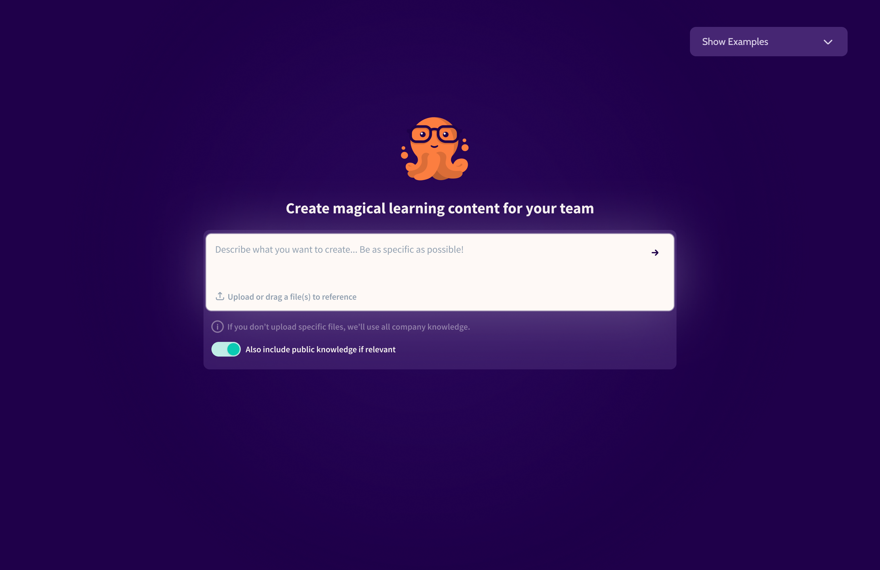
What if learningfelt like scrolling?
Short-form lessons. Social feeds. Gamification loops. AI-generated content. We designed a platform that turns training into something people actually want to open.
From zero toSeries Seed.
I joined as the dedicated design partner from day zero, before there was a product, a brand, or a single screen. Over two years, I shaped the entire product ecosystem: the mobile app learners reach for, the dashboard admins rely on, and the website that convinced investors this was real.
Mobile App
The experience learners love
Web Dashboard
The engine admins depend on
Marketing Site
The story that sells it

Bold. Joyful.Unmistakable.
Corporate learning tools look corporate. We built a design language that refuses to. Every color, every typeface, every interaction was chosen to spark curiosity and make people feel like they discovered something good, not like they were assigned homework.
Token Architecture
Three layers mean we can rebrand without rebuilding. Change one primitive, and it cascades everywhere.
Typography
Learning that actually sticks.
Gamified. Social. AI-powered.
Lessons are short, engaging, and designed for busy teams. No more boring corporate training that nobody finishes.
Source Sans Pro everywhere. Clean enough for data-dense dashboards, warm enough for a learning app.
Components
Real components from the design system, exported directly from Figma.
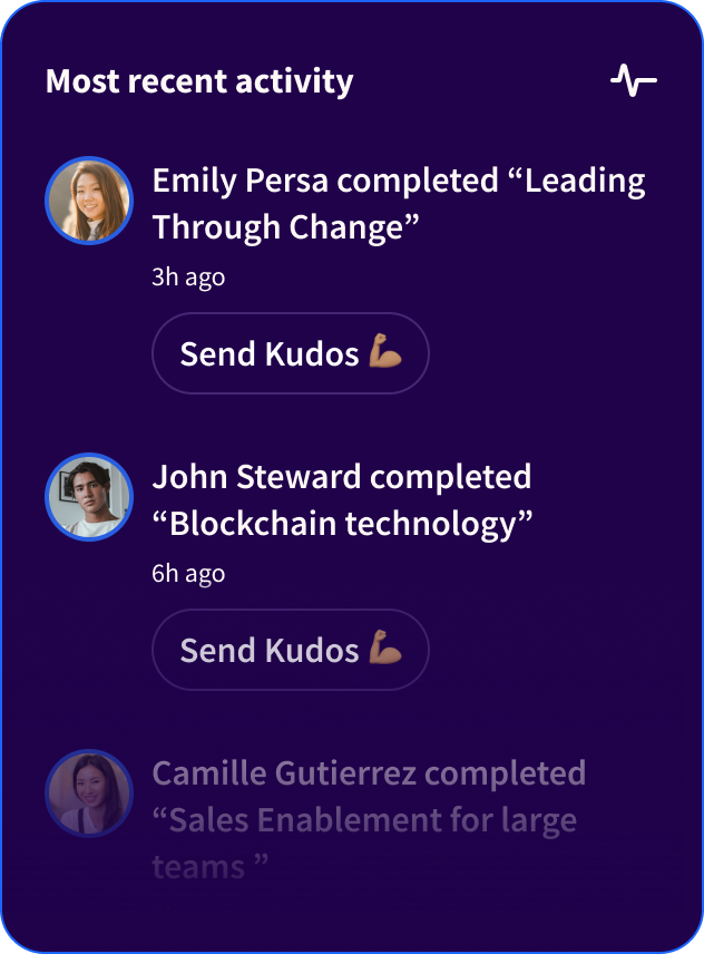
Activity Feed
Social learning activity — completions, kudos, team engagement at a glance.
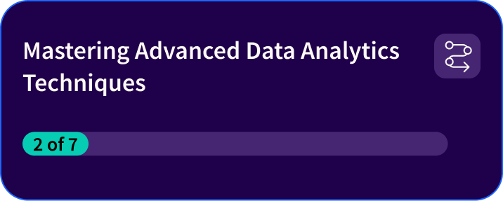
Learning Path Card
Progress tracking through multi-lesson paths with visual completion.

Featured Lesson
Hero card for highlighted content with rich media, author attribution, and CTA.
From button to billboard. One system, every surface.
Design Decisions
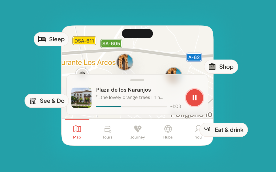
Swipe. Learn.Repeat.
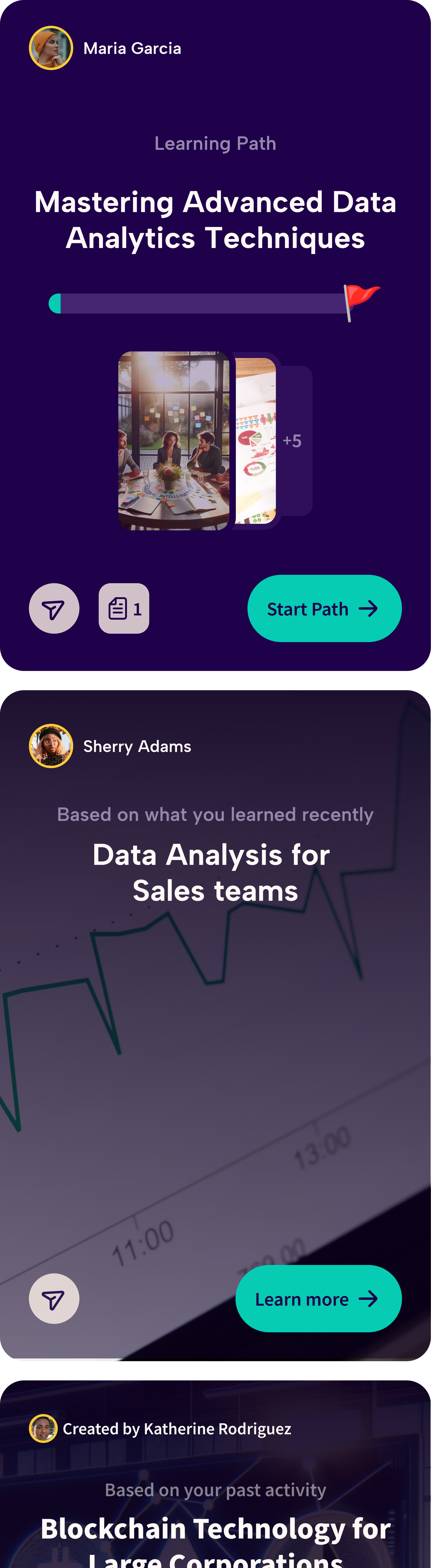
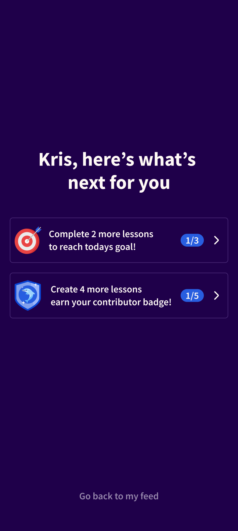
The learner app feels more like a social feed than a training portal. Lessons are short, visual, and designed for the moments between meetings. Gamification loops drive engagement. Team-based progress turns learning into a shared experience, not a lonely checkbox.
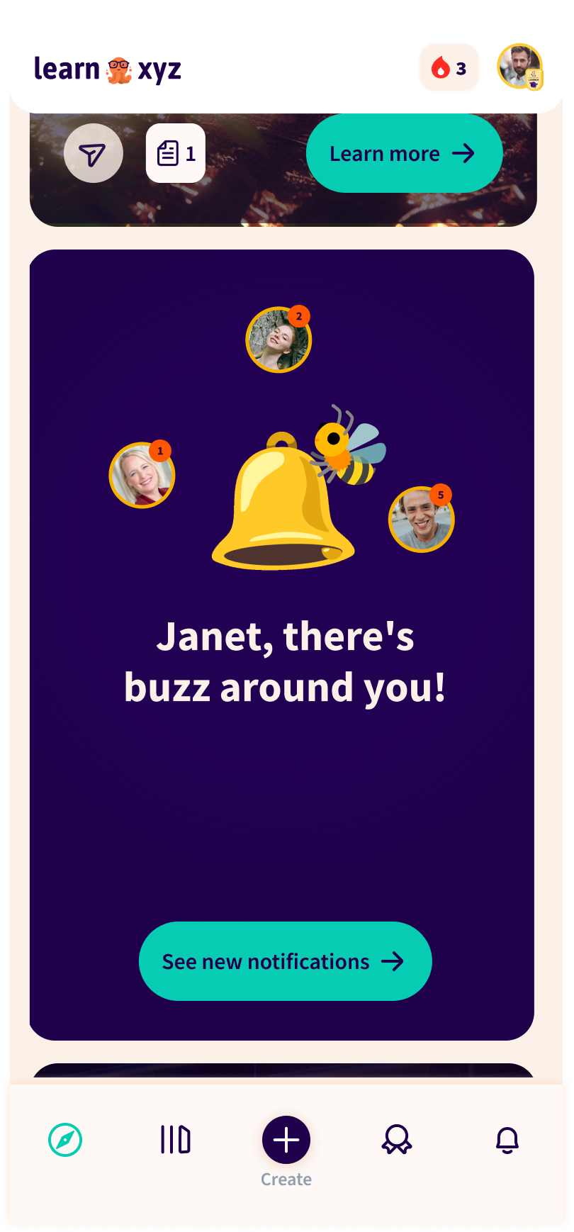
Home Feed | Notification Announcement
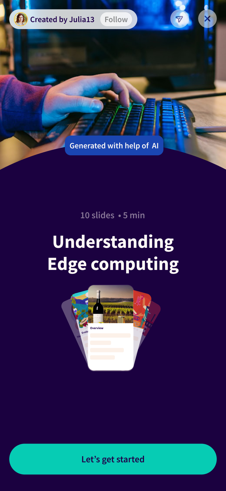
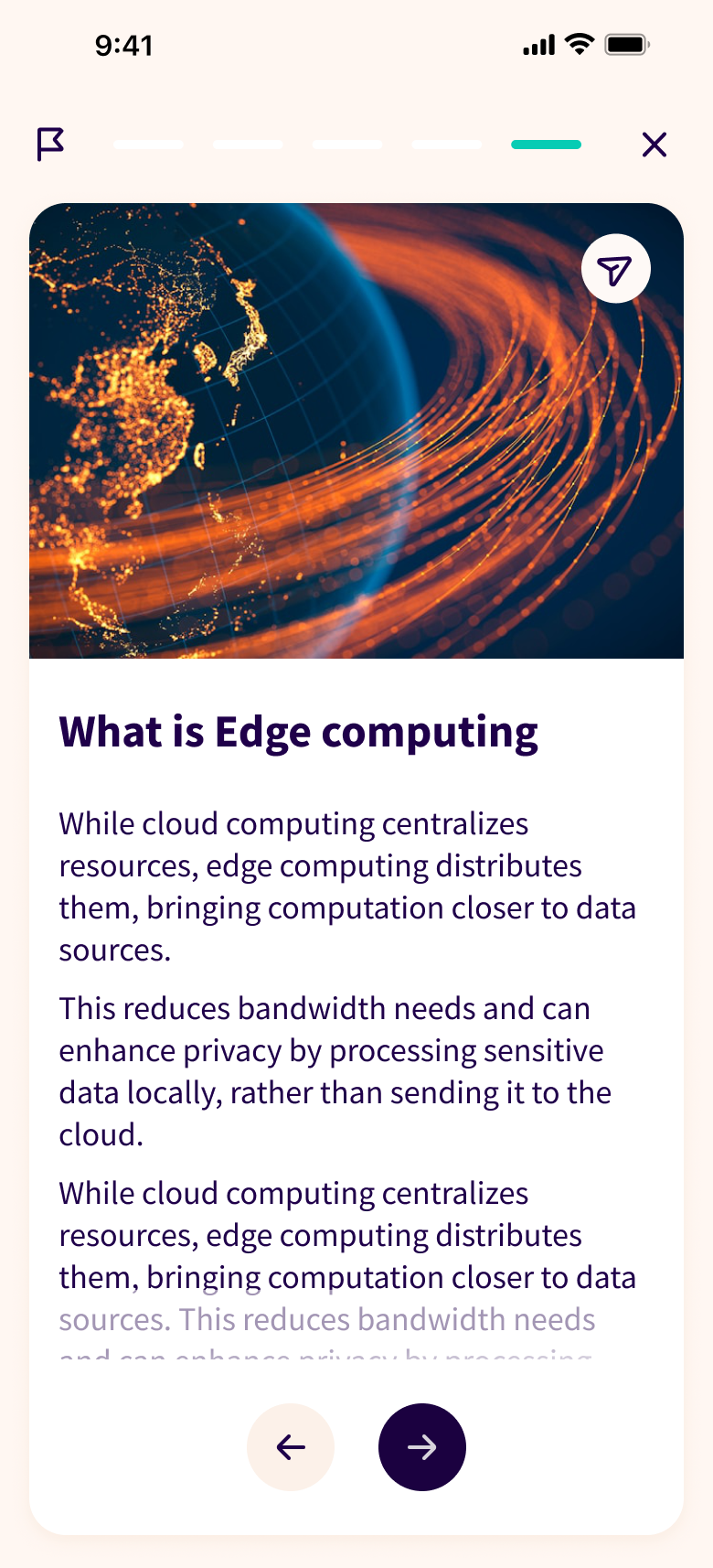
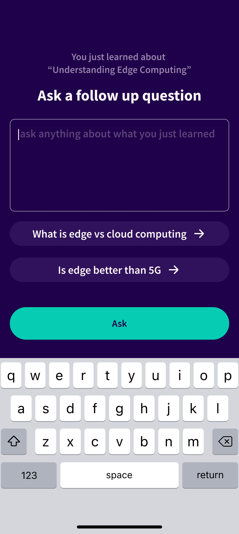
Bite-sized lessonspowered by AI.
AI generates micro-lessons learners can finish in minutes. When they're done, follow-up questions deepen understanding and personalized next steps keep the momentum going.


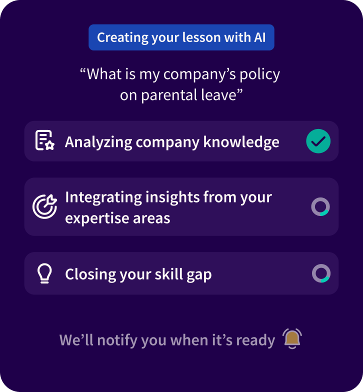
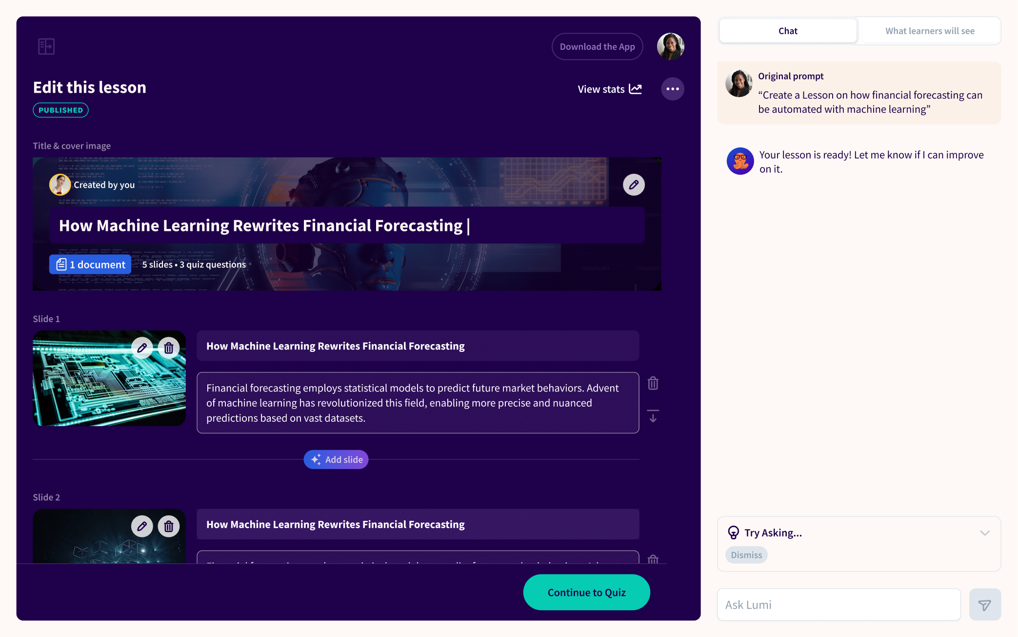
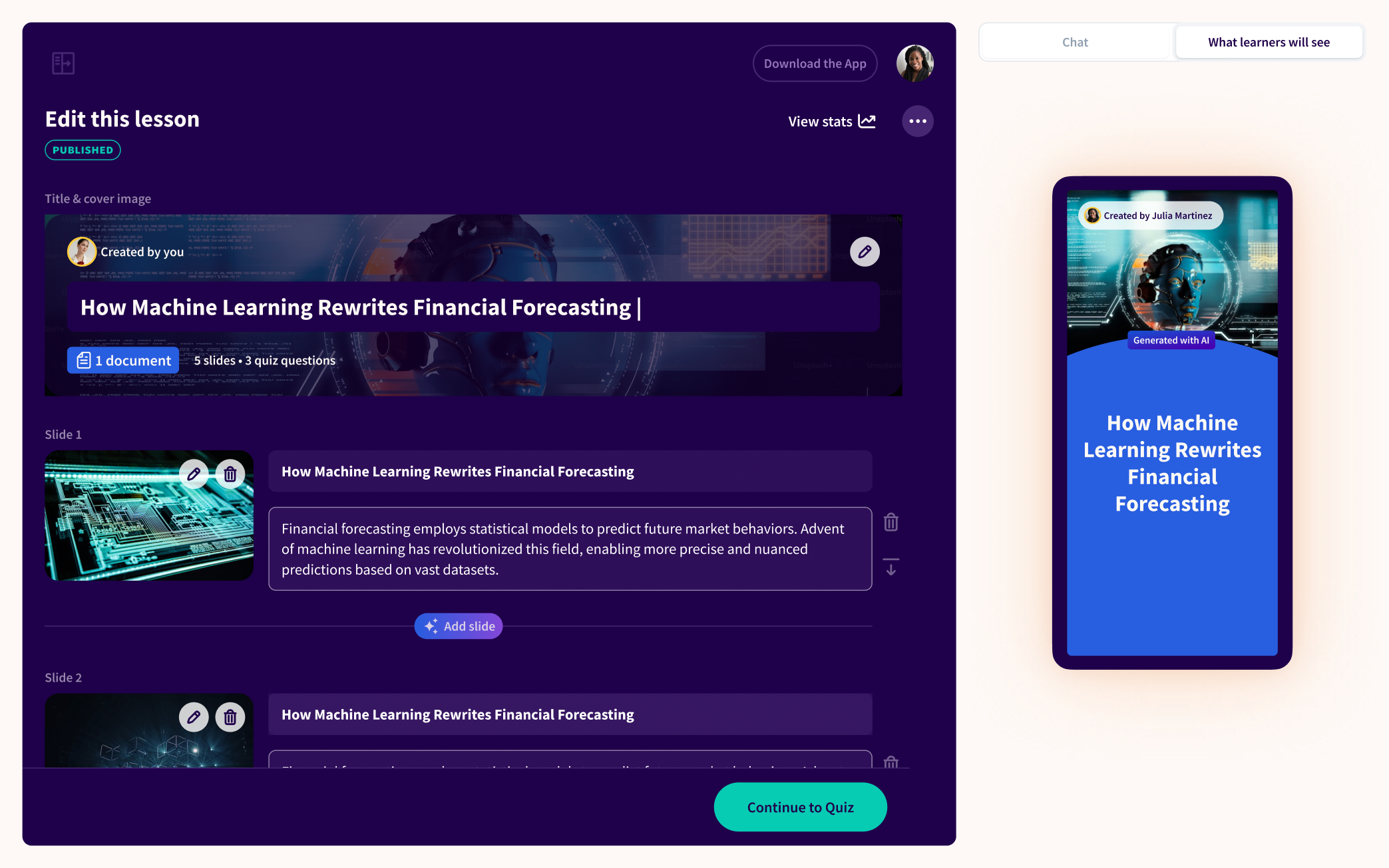
Create a lessonin minutes.
Admins don't have time for complex authoring tools. We designed a dashboard where AI generates lesson drafts, content organizes by team or topic, and publishing happens in one click. Smart defaults mean less setup. Preview tools mean fewer surprises.
Start of lesson or path creation


Not your averagetraining tool.
The marketing site needed to feel as fresh as the product it represents. We used bold visuals, playful micro-interactions, and conversion-focused copy to make Learn.xyz's pitch instantly clear: this is different, and you want in.

Homepage hero
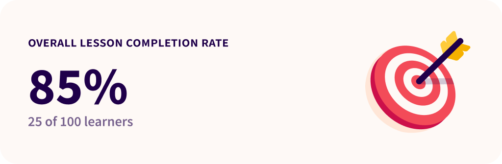
$4M raised.Udemy noticed.
Global Pilot Clients
Lesson Completion Rate
Avg. Lessons per Learner
Lessons Created in Week 1
The numbers that got investors excited, and the design that made them possible.
Looking for sticky notesand empathy maps?
There's more to this story than fits on a page. I'd rather walk you through the research, the pivots, and the messy middle over a real conversation.
Book a call“User 1 had issues finding the right learning path”
P1“I forget to open the app after the first week”
P2“Can I share progress with my team?”
P3“Navigation gets confusing after lesson 3”
P4“The gamification makes me want to come back”
P5“I wish I could pick up where I left off”
P6“Completion rates drop after day 5”
P7“Why can't I see what my colleagues are learning?”
P8Real quotes from user research sessions
Pilgrimz