Partner: Pilgrimz
From AI design debt to a system the whole team runs
A cultural travel app growing fast across Europe, held back by invisible AI design debt. We built the system underneath it, then redesigned the flows that turn first-time users into returning ones.
 Hidden gem

 on this tour
From AI design debt to a foundation Claude can build on
Pilgrimz was designing straight in Claude with a few guidelines, and every screen added debt. Phase one built the missing foundation, and built it to be read by AI, so a tiny team gets great, on-system output from the first pass instead of racking up cleanup rounds.
Color with psychology and accessibility applied
The base red was retuned into a coral primary reserved for action. Teal carries exploration, amber marks featured and sponsored, and warm neutrals replace cold grays. Contrast was a constraint throughout, not an afterthought.
The error red stays deliberately distinct from the coral primary, so an action never looks like a failure. Click a family to copy its hex.
A voice that reads as a knowledgeable guide
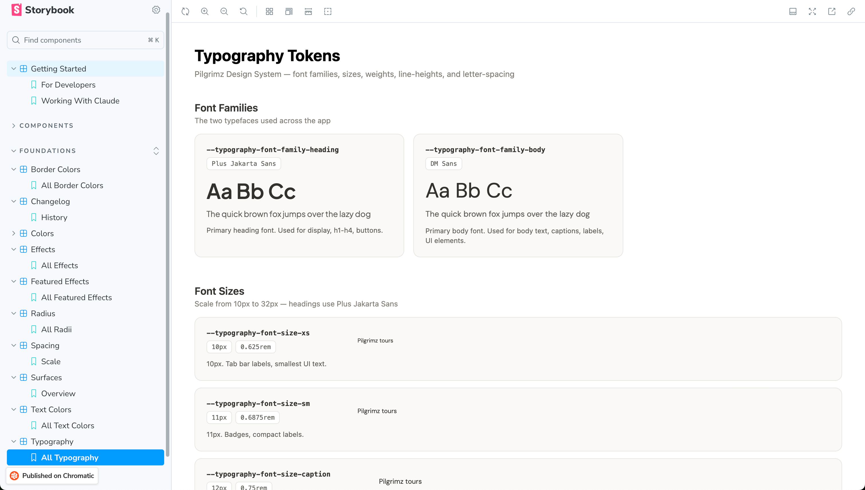
Plus Jakarta Sans for headings and display, DM Sans for body and UI. The full scale, weights, line heights, and letter spacing are defined as tokens.
Components connected back to tokens
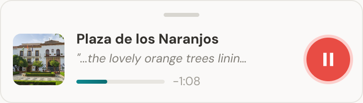
The pieces travelers touch every day: play an audio guide, tap a map marker, browse tours, events, and hubs. Every component draws its color, type, and radius from the tokens, so the product holds together as it grows. They are live, try them.
 Hidden gem
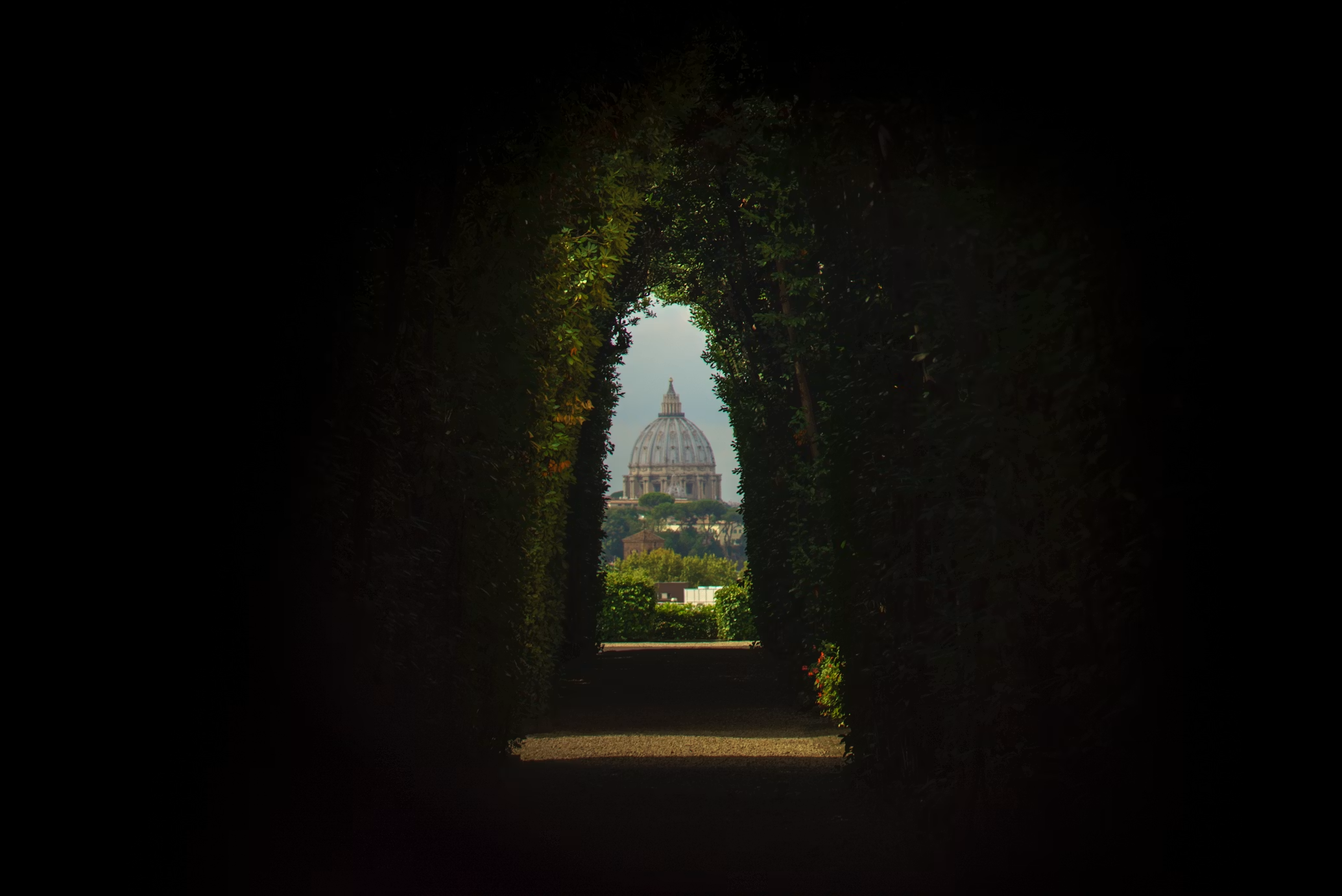
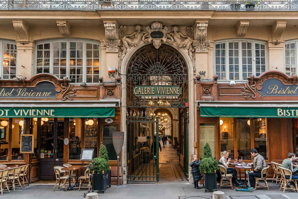
Slip through the glass-roofed arcades of the 1800s, from Passage des Panoramas to Galerie Vivienne.
Docs Claude can act on
Tokens map cleanly to code, and every one ships with a description, references, and good vs bad usage. Claude knows when to use a token, not just what it is.
Hidden gemHidden gemEvery token ships with do and don’t examples, references, and the reasoning behind them, so output follows intent, not vibes.
Decisions made on real screens, not swatches
I showed color and type living on primary screens with usage guidance, so the founders could judge the system where it matters, on the product.
The Claude Design OS
I did not stop at tokens. I built Pilgrimz an operating system for designing with Claude, so great output is the default, not luck. The concrete promise to the founders: ask Claude to build and test a feature and get something on-system in about an hour.
The whole team, not just designers, left able to run the OS themselves.
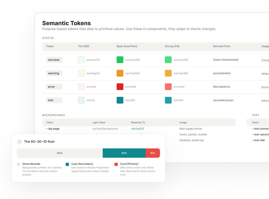
Created so Claude can read it. Not just tokens and values, but the context and intent behind them.
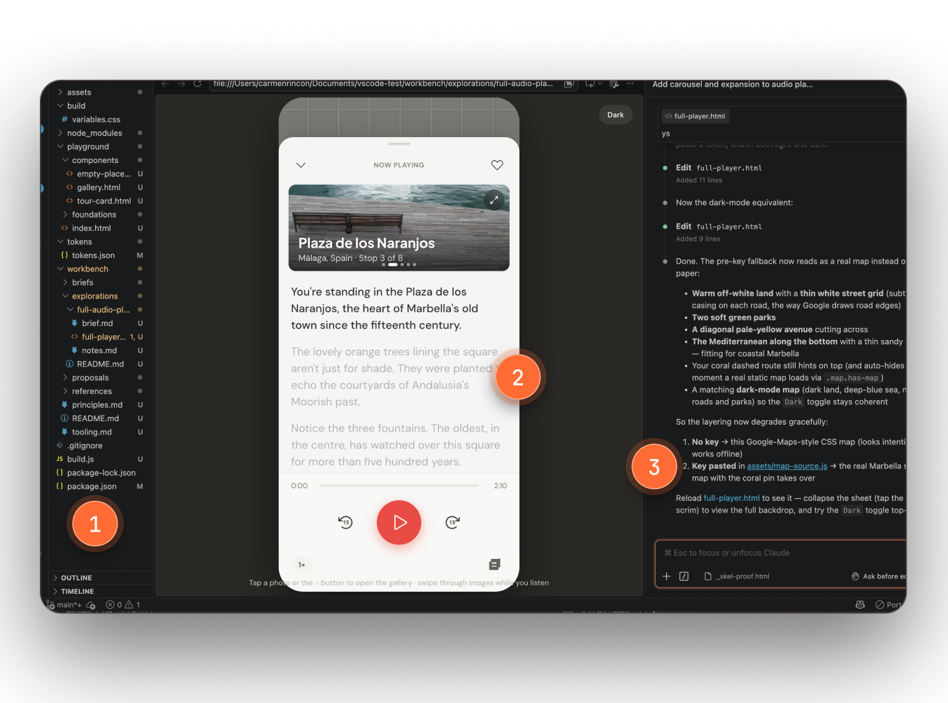
Skills, agents, and files wired into the tools the team already builds in.
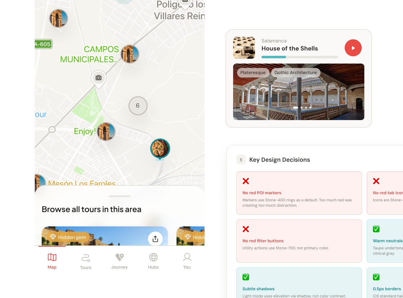
The OS carries Pilgrimz's own craft rules, so output looks like Pilgrimz, not like generic UI.
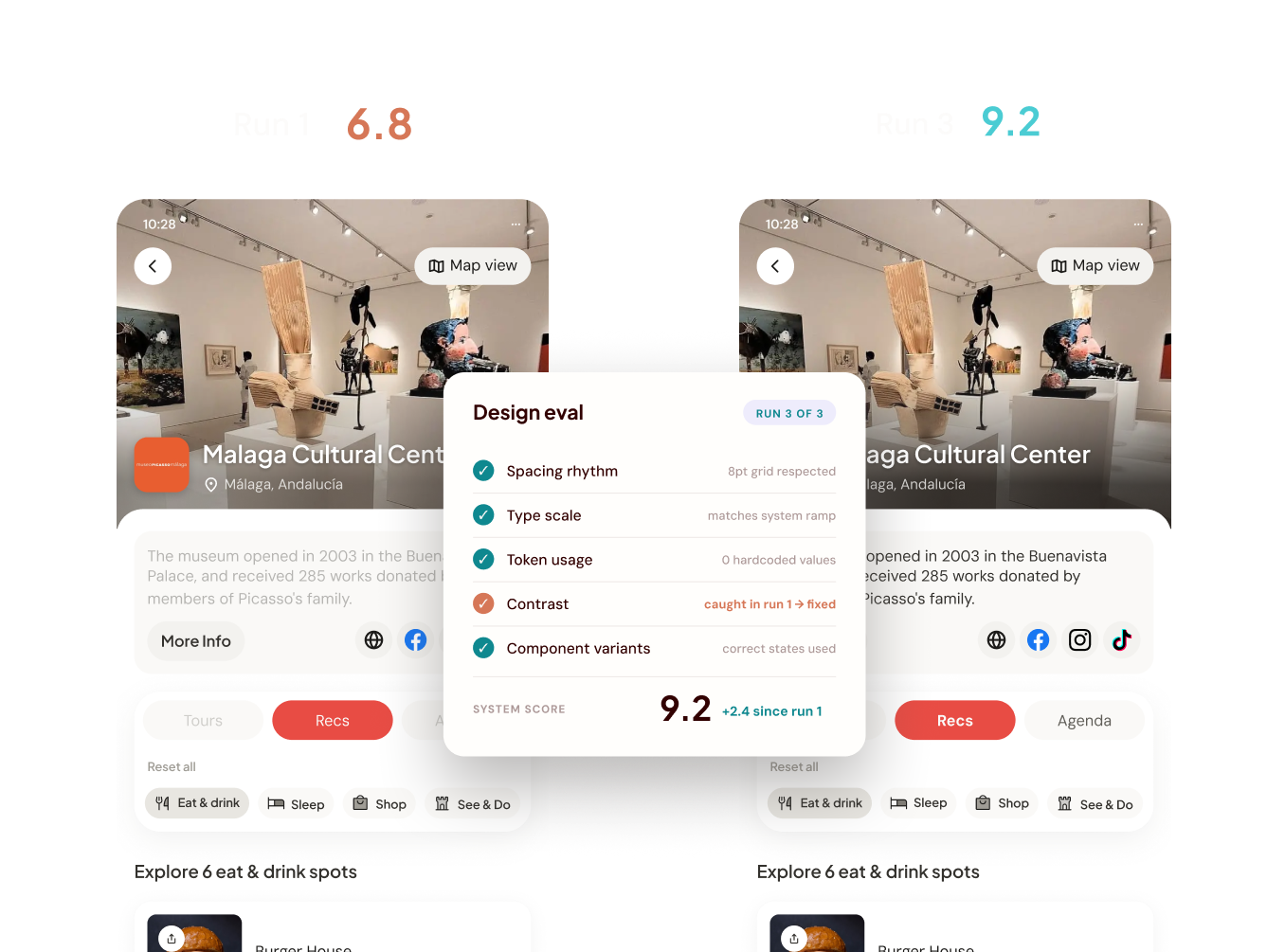
Quality checks built in, so the team can trust what ships without manual policing.
With the debt paid down and the OS in place, the work shifted from cleanup to real product strategy.
Core flows, restructured around trust and the business
The redesign was downstream of the OS. I designed these flows myself, with Claude working alongside as another member of the team, so core screens were reworked quickly and stayed consistent. Every choice served trust, retention, and the business.
The map as a primary surface, not a backdrop
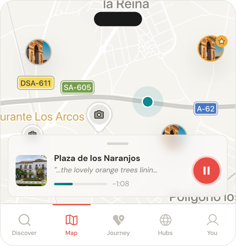
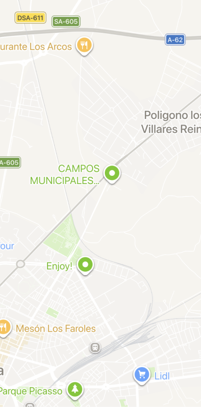
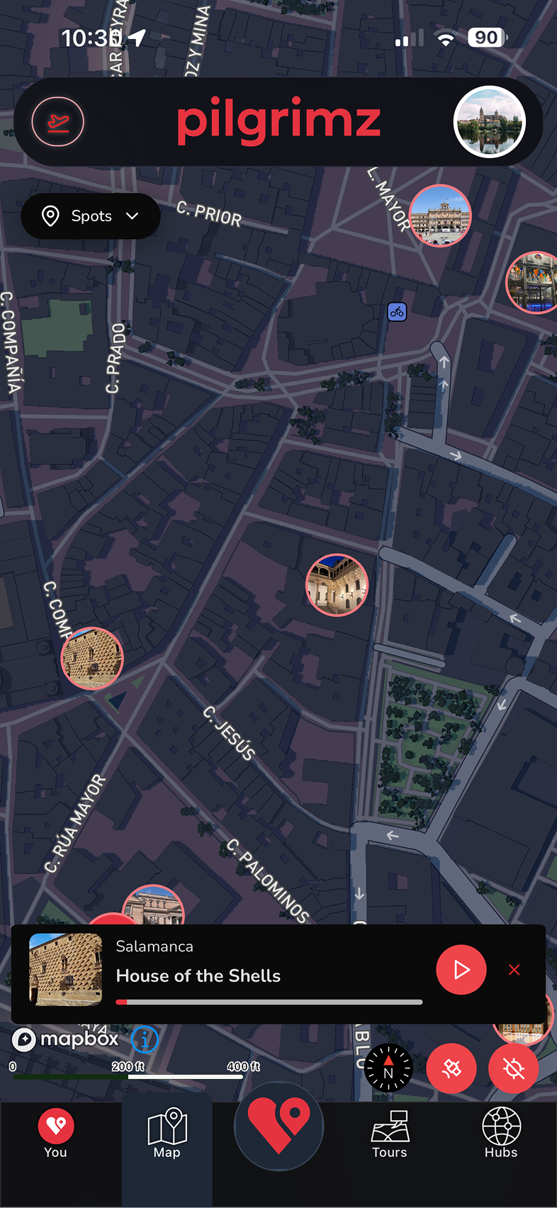
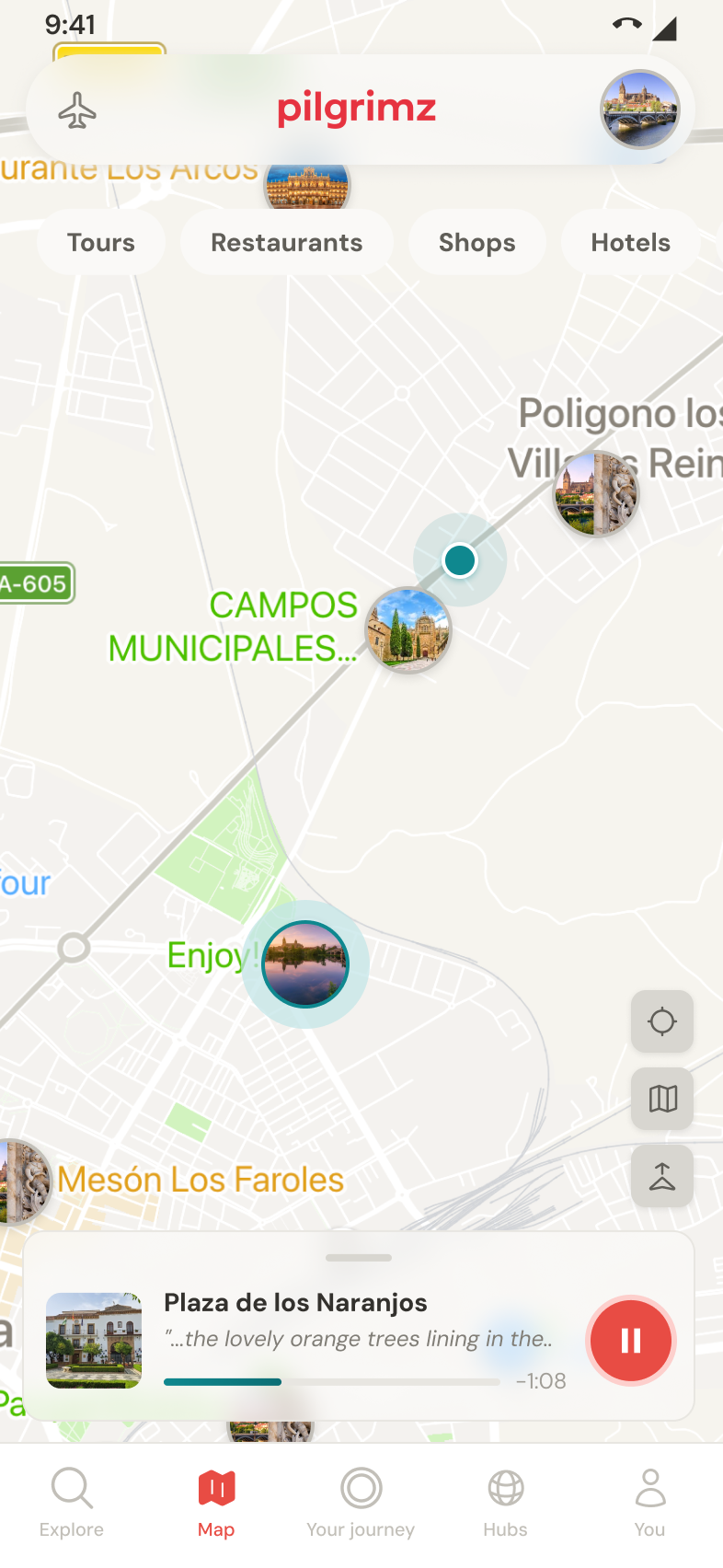
Users struggled to move between cities without zooming the map, reaching for a search they could not find. The redesign made moving between destinations obvious, differentiated point of interest types, and surfaced sponsored places clearly, which ties straight to how Pilgrimz makes money.
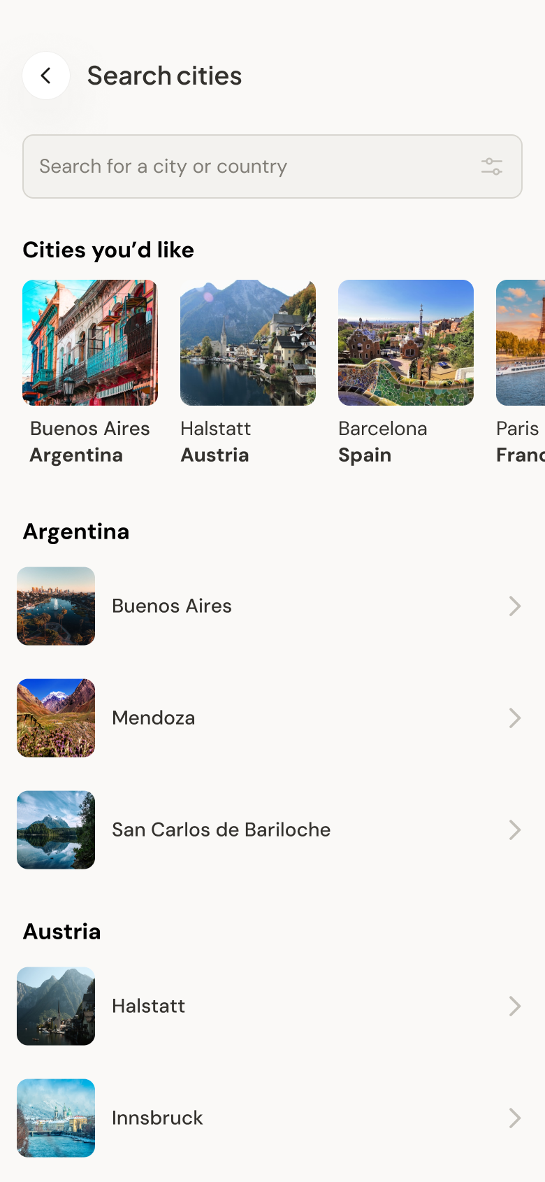
The B2B revenue surface, made premium
Hubs are curated spaces from museums, tourism boards, and cultural organizations, the business to business product Pilgrimz sells. I redesigned them as branded homes each institution can be proud of, from the first impression to the empty state.
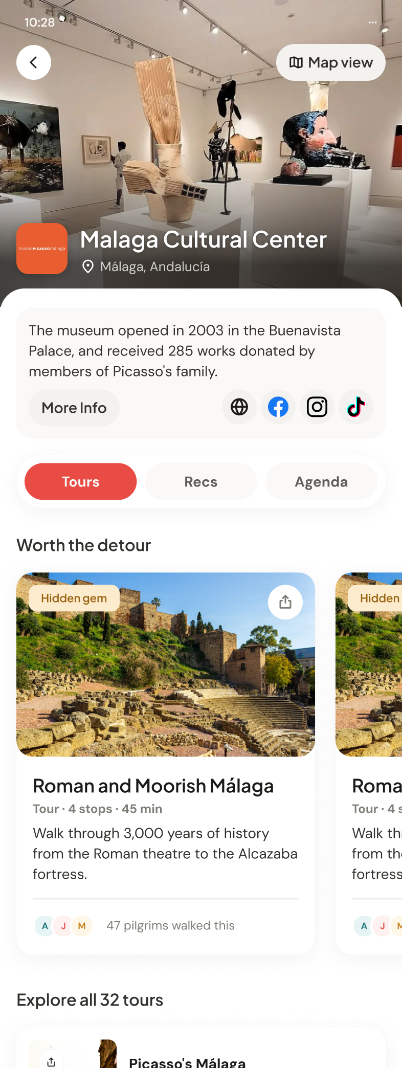
The institution leads: hero, logo, and its own story. The Malaga Cultural Center opens with the Buenavista Palace and the 285 works donated by Picasso's family, with More info and its social channels right there. Below, the Tours tab puts routes worth the detour up front and the full catalog, all 32 tours, one scroll away.
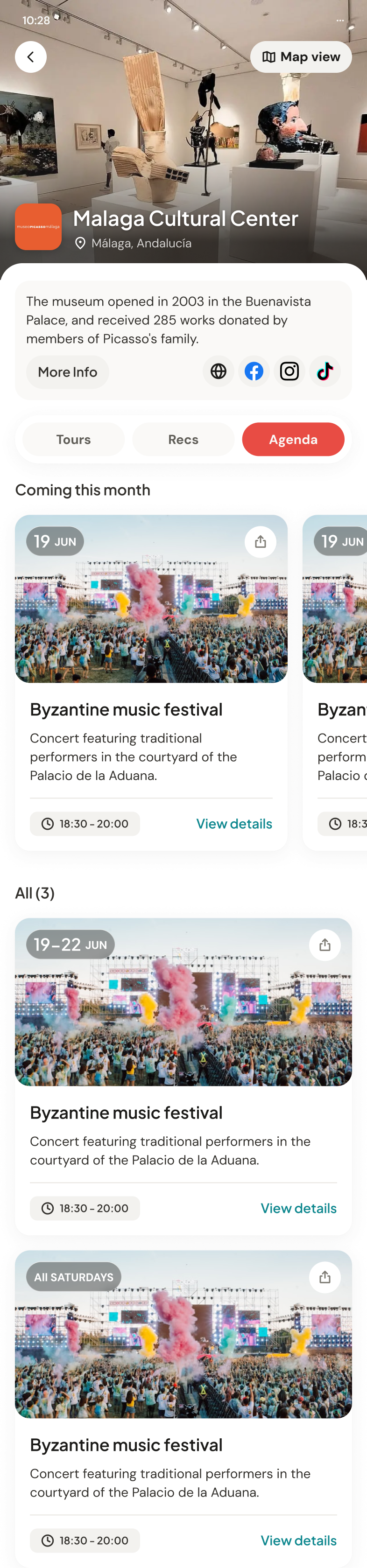
Events carry their own logic: single dates, ranges like 19 to 22 June, and recurring runs like all Saturdays, each with times and details one tap away. This is the surface institutions pay to fill, so it reads like a program, not a feed.
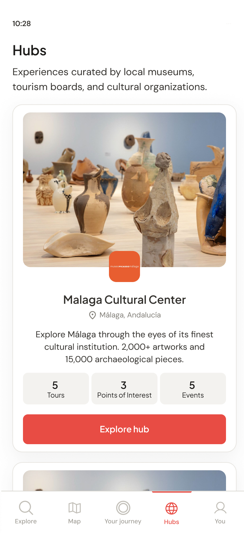
The Hubs tab pitches every institution with its numbers, five tours, three points of interest, five events, and one clear action: explore the hub.
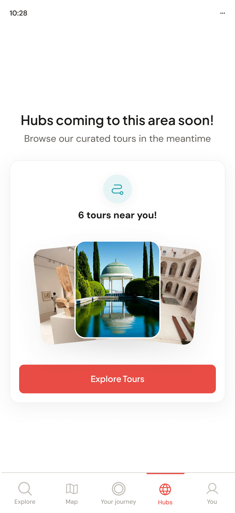
Areas without hubs get a coming soon state that points travelers to the tours nearby instead of an empty screen. Even the gap sells the product.
Consistent from the map to the audio guide
The same journey, screen after screen: browse tours in an area, open one, walk its stops, and let each point of interest talk to you. Every screen is built from the system, so it all reads as one product.
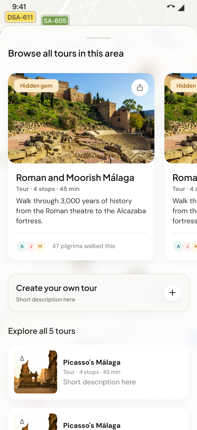
Tour discovery
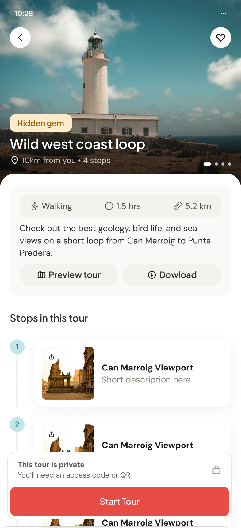
Tour page
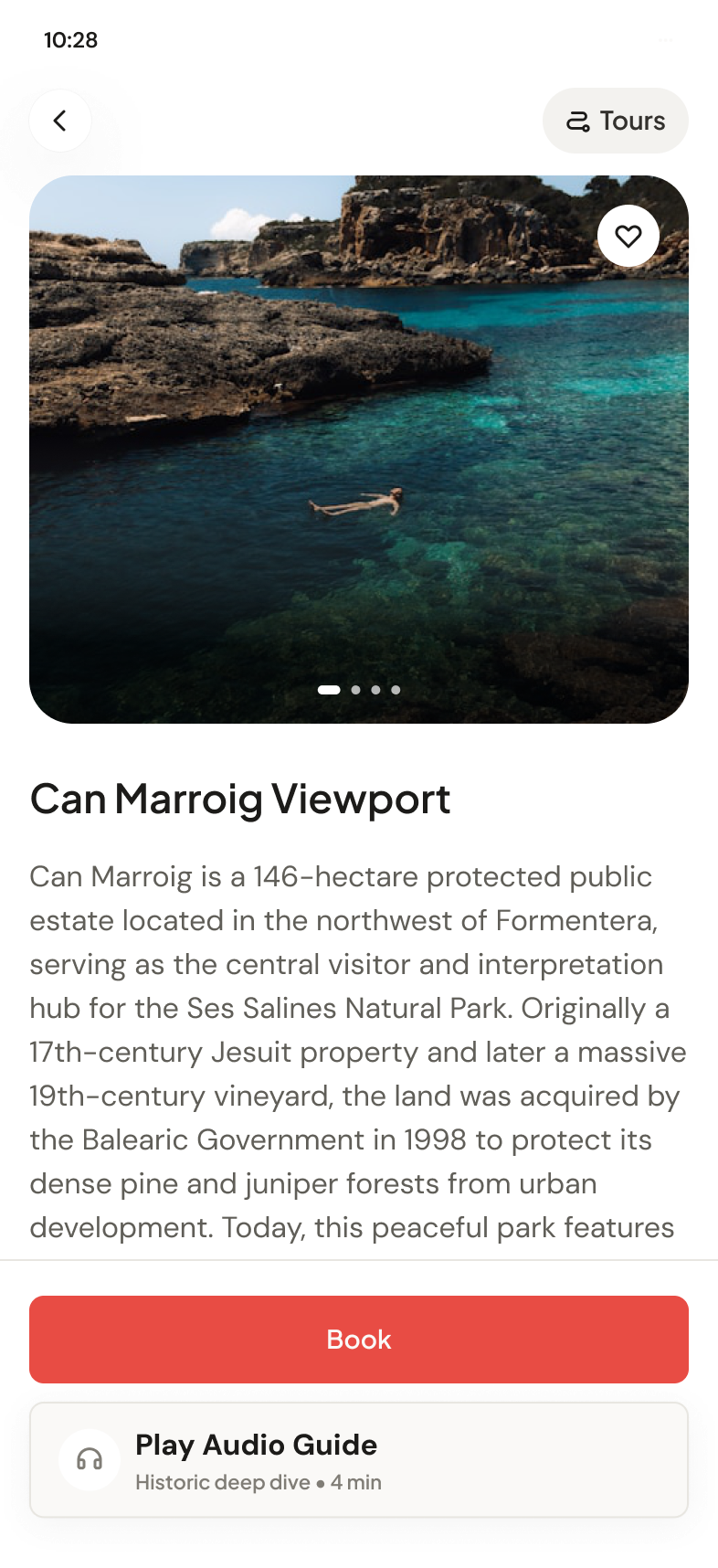
POI page
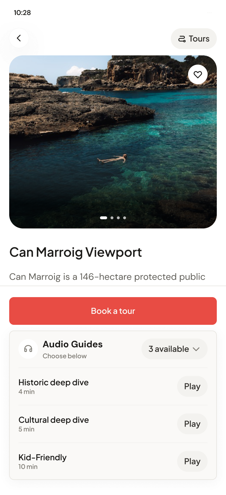
Audio guide picker
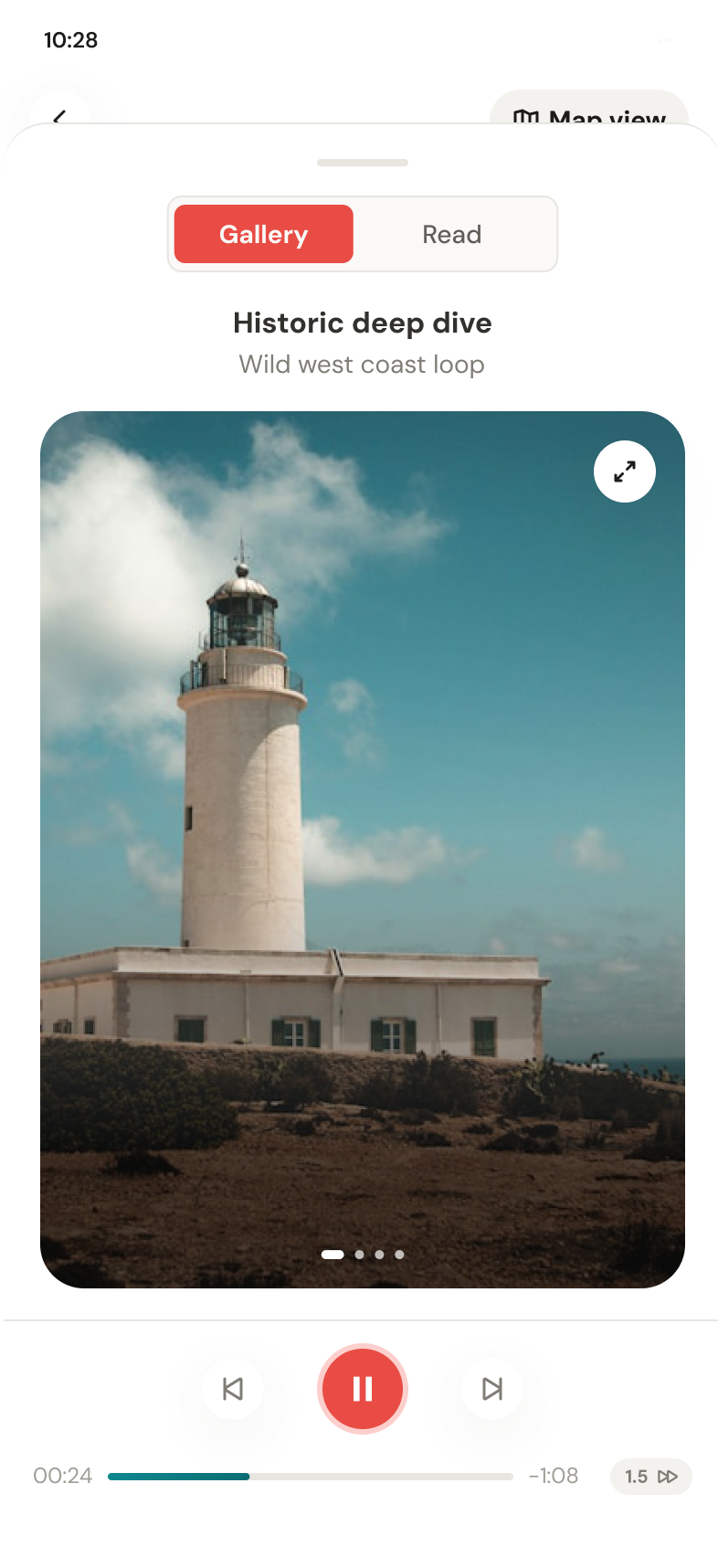
Player, gallery mode
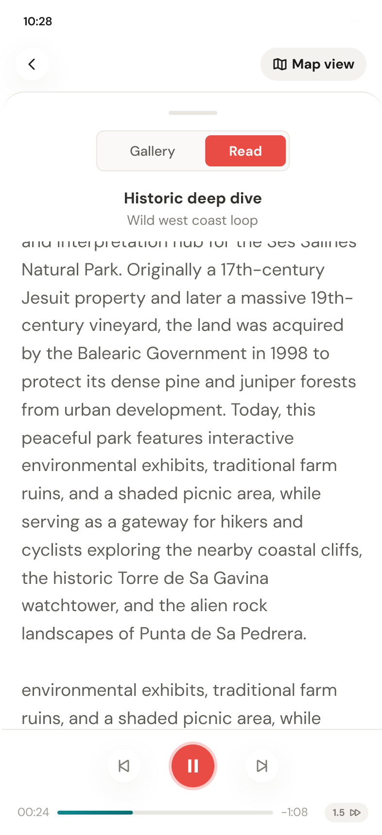
Player, read mode
Consistent, trusted screens are the groundwork for the part the founders most want next.
A social layer built around places, not strangers
This is the chapter underway now. The old feed showed strangers' activity with no reason to care, so social is being reframed around destinations. The useful unit is many travelers found this place great for solo travelers, not this user took a Tuesday walk. Two of the interactions in design right now: rating as the door into a tour's community, and invites that carry the plan instead of a dead link.
Discovery rethought around places, inspiration, and saving destinations for later, not a social network of strangers.
Quick tags after a tour, like good for solo travelers or great coffee, that improve the product without asking users to perform.
Cards built for outbound sharing to Instagram and WhatsApp, designed to inspire the person who receives it to go do the same.
What Pilgrimz walked away with
No invented numbers. The value is trust, consistency, speed, and infrastructure the team builds on every day.
Screens come out on-brand on the first pass, no cleanup rounds. New work stays inside the system instead of adding drift.
The team ships more, inside a system designers built, so quality never dilutes as they move faster.
The map, tour pages, and discovery were restructured so travelers always know where they are, what a tour offers, and why it's worth paying for.
Museums and tourism boards get a branded home instead of a listing, from the first impression to the empty state. A stronger pitch for the business side of Pilgrimz.
One workshop later, the whole team designs through the OS. Not just the designers.
No more twenty rounds of iteration and long prompts. Claude understands the system from the first pass.
The Journey
The AI-enabled foundation
A design system built to be read by AI, plus the infrastructure inside Claude (Skills, agents, and context) so the team ships on-system.
The design work
Core flows and screens restructured around trust, retention, and the business, fast and consistent because the foundation existed.
Social discovery
Reframing social around destinations and inspiration. The chapter underway now.
Looking for sticky notes and empathy maps? Let's chat instead.
I'd rather tell you the real story over coffee ☕
Book a call
Water.day
UX Design